Tuesday 30 December 2008

Big Night Out (Epilogue)


Another appearance for 'Mara.' Somebody on Renderosity actually asked me the backstory behind this one. Let's just say it's 'River Walk' an hour or so later; when the large number of bacardi chasers and triple vodkas took its toll. The vomit was, I think, a picture of chillis which I found somewhere on my computer. Most of the effort for this one was spent getting the camera angle right. The bathroom was another model from Poser Nation. As with all small spaces, it was a hell of a job getting the camera back far enough to see the scene, but not so far back you're passing through the wall. I also couldn't take the usual step of deleting the far wall because of the mirror reflection. One day I may make another vomiting picture and this time capture how people actually crouch over toilets, instead of this weird posture I've devised here.

Saturday 20 December 2008

'River Walk'


Another favourite from my earlier creations. A comment I liked on Renderosity remarked that this pair were the sort you avoid at chucking-out time. Actually they were inspired, in terms of general exuberance if not appearance, by most of the women I've ever been drinking with. Maybe it's a Yorkshire thing. Nick-named Mara and Sophie, they went on to feature in several other images. Sadly they are now lost forever in the faulty hard drive of my last computer. As is the pub facade; which took forever to build and was only used here, where you can barely see it. The trainer sign is one of those in-jokes only I will ever find funny, so I won't bother explaining it.

'Christmas Morning'

A rather more cheerful offering this Yuletide, after last year's Gloom-A-Thons. It's loosely based on the chaotic Christmases we have every two years at my sister's. Though you'd have to throw in a few more people and quite a lot more mess to get close to those sessions. Even as it is, this one took forever to build. It also suffered the same curse as all my multi-figure images: as time drags on you get less and less fussy about perfecting postures and expressions. I think, though, that only the boy in the foreground has turned out poorly. Incidentally, I am not the maungy bugger in black nursing a hangover. My general demeanour is more like Grandad messing about with the children. Though philosophically obliged to be cynical towards it, I do love Christmas.

Sunday 14 December 2008

'Nativity'


The second of my 2007 Gloomy Christmas images. Also a good example of idea being let down by execution. The theory is decent enough. A modern day Jesus is born on the streets to immigrant parents; the 'wise men' are two cops and a social worker who promptly whisk him into care. But the figures are all as stiff as hell, particularly the two men. The social worker's feet are also sinking into the ground; a common problem with high heels, which are almost as hard to model as they are to wear. (Although, I hastily add, I've never actually tried the latter.) Only baby Jesus comes out well, happily oblivious to the faults all around him.

Thursday 11 December 2008

'Something Missing'

Done last Christmas. By now I'd discovered Poser World, a pay site particularly good at props and backgrounds. I still make my own backgrounds from scratch if necessary. But all too often I can't be bothered and use ones built by cleverer people. The one used here is a special Christmas lounge; it was simply a matter of stripping out pretty much everything festive. The pictures are both renders I did seperately and then imported; rather heavy-handed hints as to the thing missing. The book cover, meanwhile, is one I'd already designed for one of my own novels. And if he's reading one of my books, it's no wonder he's looking glum.

Sunday 7 December 2008

'A Fun-Filled Year In Finance!'


A more recent composition, to break with the rather pointless chronology of this blog. The background is based on my own little corner of Hudson House, York, though it's probably a common scene. Someone on Renderosity even accused me of sneaking into her own office. The point, of course, is conveying the passage of the seasons through little details while the office drones continue with their identical tasks regardless. I suppose I could claim a statement about modern alienation from nature. But it's basically just done for laughs. The heavy-handed sarcasm of the title is probably unnecessary, but that's never stopped me from heavy-handed sarcasm before.

Friday 5 December 2008

What The Hell?

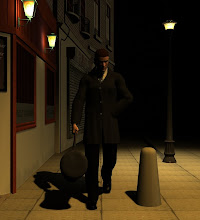
A big problem with writing novels as a hobby is that the first question people ask is, “Have you been published yet?” If you haven't, you can spend as much time as you like explaining how you write for the intrinsic love of it, and it still won't matter. You still end up sounding like a loser. A big problem with using Daz or Poser as a hobby is that most people don't know what you're talking about. And there's no easy way to describe the activity or even an agreed term for it. Some use “3D modelling”, which sounds too much like something done by men with beards who hang around Games Workshop. Others prefer “rendering”, conjuring up visions of a particularly gruesome process carried out in abattoirs. I favour “computer aided art,” rather pompous but that never holds me back. Or more usually, “that kind of, you know, drawing thing I do on my computer.”
And what the hell is it anyway? Well, rendering takes place initially on a virtual three dimensional canvas. Things are loaded onto this canvas. Each has various dials attached which determine various aspects of their being. In this sense, it is literally drawing by numbers. There are three basic types of said 'things.' The cameras control what is seen, generally called Point of View. (POV; and not to be confused with that distressing BBC programme once hosted by Anne Robinson.) You can make them move up and down, side to side, focus in and pan back, whirl around to look from any angle. The lights, obviously, determine how something is illuminated, and what angles, how brightly, in what shades and the strength of the shadows. And the objects are basically everything which makes up your image.

Objects can be whatever size you choose, whatever dimensions. Unless you are a design genius you tend to buy or crib a lot of the more complex ones already built. But you can fashion some from the basic cubes and spheres which come with Daz. Objects can also be placed anywhere you want, one factor making the process tricky. Gravity and solidity have no meaning in this universe. If you aren't careful you get a chair sticking through the floor or hovering half a foot above it. The simpler objects are, in themselves, static. Others are made up of separate parts which can also be manipulated. Perhaps the most complex, and also the starting point of many images, is the human body.


The Daz male and female bodies, called for some reason Michael and Vicky, are split into numerous components – neck, head, feet etc. The versions I grew up with had fifty five different parts though the latest have slightly less, inexplicably choosing to combine thighs and buttocks. You cannot actually split them up. But you can bend each one, twist it, move it from side to side. You can alter the dimensions and choose from a range of basic body types. (Which, inevitably, leads to many teenage artists selecting the biggest knockers possible for their female models). As for the faces... There are a fantastic number of ways in which expressions can be altered. The latest Vicky model has six preset ones: Happy, Sad, Afraid, Disgusted, Angry and Surprised. Presumably Daz considers these to be the basic emotions of humanity. But you can vary these in any number of ways or build your own expression from scratch. Facial features, from the temples to the chin, can also be manipulated at will. Interestingly, the figures start as a classical model of beauty. Each change you make will leave them a little bit uglier. This has to be something to be applauded.


Perhaps I have exaggerated the complexity of the whole exercise. But this is what, for example, the Michael model looks like when you first load it:
(Leaves added for modesty, though in fact they are hiding nothing. Michael is essentially a neuter and if you want genitalia, they have to be stuck on as an extra object.)
It is remarkably difficult to get him to lose all that stiffness, to adopt a posture at all natural. If you want him to, say, hold a mobile phone then you have to place it exactly right in his palm, get all his fingers curved so they are touching the phone without actually shoved into it. Then swing his shoulder and forearm up so the phone is somewhere near his head, a surprisingly tricky task. Then figure out what his other arm, the one not really doing anything, should look like. It isn't drawing properly. It is much easier. But you have to learn some of the same skills to turn a vague idea inside your head into a precise image. And along the way, rather a lot of different parts of the body. I now know what a lacrimal is, for example, and that there really are more muscles in the arm than there needs to be.


The other main part of an object is the surface colour; the texture, as it called. Unless you want the picture to look like it belongs in a children's colouring book, the texture for many objects has to be quite complex too. It is usually an image file done on something like Paintshop and then applied to the object. And the contours have to be exactly right too, otherwise you get weird white gaps appearing everywhere. You can control how opaque the model is too, how glossy it will be. And its reflective qualities, something called refraction, something else called displacement. And so on, until you start wanting to add a physics degree to the art and biology ones you have already had to get. Either that or you just wing it and hope for the best.

Finally, when you have all the objects positioned perfectly, when they are all coloured in right, when the camera angle is correct and the lights are gleaming... You hit Render. This turns the three dimensional model into a two dimensional image. More importantly, into a file which can be read quickly by any other computer in the world, rather than the 0.0001% which also have Daz installed. Or even something which can be printed out, if you are feeling quaint.


Then you peer at your render and finds it look rather different to spectacular figure which you first dreamed. So you go back to Daz, fiddle around with the dials again, bite your lip somewhat; and hit Render again. Then study the amended image, sigh some more, fiddle some more. And so the long night wears on; and so your youth slips away.

Thursday 4 December 2008

'Recovering From (This Week's) Seizure'


This was my first attempt at serious 'postwork' i.e. dicking about with the image in a Paintshop-style program after rendering. The man and bed were left as they were. The background was messed up in various ways, to try and show how the world around you seems messed up when you're having a seizure. Then the pair were kind of welded together. It doesn't really work. Partly because of the annoying line which persisted around the figure. But mainly because you can't portray a seizure just using jazzy special effects. And the lighting, which makes the mattress glow like a candle, is ludicrous. I tried a similiar thing recently, with a new program and a whole year of experience to back me up. It also didn't work.

The figure originally wasn't supposed to be me. But any epilepsy image I do is going to turn into a self-portrait sooner or later; so eventually I just went for it. Not a bad likeness, though of course I never wear jeans. The dark patch on the mattress is supposed to be drool, an endearing feature of many of my seizures.

Sunday 30 November 2008

Origins

Three factors led me to the practice generally, if clumsily, known as 'rendering'. One was an increasing interest in visual art. The second was my constant desire, retained since early childhood, to emulate anyone and anything I admire. And the third, hinted at by the title of this blog, was my intrinsic inability to paint or draw. And I mean that. Bottom of the class at art in school and never likely to go anywhere else. An unsteadiness of hand or some imbalance between left and right spheres of the brain or – or whatever. I will never be able to write like Margaret Atwood either, but I can at least knock together a halfway competent novel. And whilst being tone deaf, I could hitch a wagon to the music train briefly by learning the drums. The art thing, though, seemed insoluble.

Of course, in the era of Young – or nowadays, not so Young – British Artists, this shouldn't have mattered too much. Perhaps Damien Hurst or Tracy Emin can't sketch anything more sophisticated than a sun with a smiley face either, and this has never slowed them down. However, these were never the people who inspired me. I have never wanted to pickle sharks or fill houses with concrete, except for laughs. I was always drawn to the serious realists. Caravaggio, Manet, Rembrandt, Hopper, with their pitiless, often cruel depictions of alienation, pride and suffering. Put a mirror to the world, never mind whether or not it enjoys the experience. There was just the small drawback that I couldn't build the mirror.

So, as tends to be my response to any problem nowadays, I turned to computers and the internet. For some time I was aware of three dimensional modelling programs, where the software does most of the serious work and you are left free to tinker around. Or, to put it slightly more charitably, you provide the inspiration and your computer the perspiration. The brand leader is called, rather aptly, Poser. It costs a hilarious amount of money. I was trying to work out how to justify a purchase to my bank balance and soul when I stumbled across a cut-price version called Daz Studio. So cut-price, in fact, that the basic software is free.

This is of course a cunning marketing ploy rather than an act of benevolence by Daz. You end up buying so many add-ons and appliances to get that software to do anything whatsoever that the eventual spend is itself fairly hilarious. But you can't the stuff with you, I suppose. And now I can claim to have one more string on my creative bow. I can study a Brueghel and plan how to rip him off. I can pretend to be an artist.

Saturday 29 November 2008

'Artist and Easel Circa 2007'

A fun one to create. Just a shame I didn't spend as much time on lighting and background as I did on the props. The juvenile clutter was inspired by my brother-in-law's computer room; he even has a framed map of Middle Earth on his walls. This and other details mark a start of a serious messing about with textures. The Sonic Youth poster was modified from a pirate map model; the Wallace & Grommit mouse map built from scratch. The image on the computer was a screen dump taken from Daz Studio, using the god-awful fairy models you get free with the software. It was supposed to be a parody of the many, many fairy images which clutter up sites like Renderosity. Though most of those artists, unlike myself at this stage, know how to use lighting effectively.

Friday 28 November 2008

'Hoopoos Spotted At Blackmarsh Reserve'


This is another early one I quite like. It was inspired by those birdwatching fanatics, my mum and dad. And of course, dad promptly informed me that real bird hides would never have a shelf on the outside. I reminded him what 'artistic license' meant. He didn't pick up on the fact that to get the look right, the man's binoculars were actually protruding several inches into his head. The shadows on the hide were quite a sucessful experiment, putting a bush model out of shot but just in front of the lighting.

Sunday 23 November 2008

'Meantime'

My first halfway-decent image. I still rather like it, though the lighting's very crude. The grafitti was pinched from a photo on the web, except the York City Football Club bit, but I literally put the wall together brick by brick. I had an image of a single brick on my graphics program. So I had to copy that, paste it next to another, paste it again and again... A truly fun hour or so.
A friend claimed the blond girl's breasts are rather large compared to her body mass. I don't see it myself; and anyway, my main problem with that girl was getting her skirt to cover some of her dignity. An oddity of Daz Studio skirts is that they can't handle sitting postures. If you move the hemline in line with the thighs, chances are that the whole thing will be twisted practically off the body. As it is, too much of the poor girl's buttocks are showing; but it's the best I could do.
The postures copy Edward Hopper's old trick of ensuring figures are never facing towards each other. The title, meanwhile, is lifted from a Mike Leigh film. It's the first of several 'Disaffected Youth' pictures which are part social commentary, part wish fulfilment. I was never a disaffected youth myself. I wasn't always that happy, but was always too shy to sit on street curbs shouting at people.

Friday 21 November 2008

The First One

'The Conversation.' The first proper rendering image I did via Daz Studio. The word 'crude' barely does it justice. I had to turn the camera down in the street scene about 45 degrees to disguise the fact that I had absolutely no buildings to put behind the woman. And turn her arm at 90 degrees to her body to get her hand anywhere near her head. Also, try to not look too closely at the brickwork on the right.

It's a split screen thing, in case that isn't obvious. Two images done seperately and then welded together. The slightly obvious meaning is a bright, happy mother chattering over the mobile to her gloomy daughter, who isn't listening. The theme is alienation, of course, but I think we can say it's been done better elsewhere. It was, if nothing else, good practice.